Case Study for Reviews.com
Review Page | The Best Fish Oil Supplement
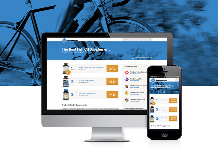
Header
In the revised header I’ve removed the link for “All Reviews.” The reason being, as it stands now, the link takes the user to a directory listing. I’d be willing to bet that most your users don’t find this directory listing useful and will often just go to the home page or use the search function. Another solution would be to expand the header, adding a menu with meaningful categories.
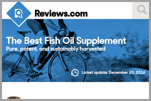
Hero Image
Under the header we have the main hero image. The purpose of this image is to condition the reader to make a purchase. In this case an image of a biker was chosen to emphasize the articles goal of health and inspire the user to make a purchase of a health supplement.
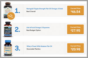
The Top Three
By creating a clear, numbered list, that includes a clear winner, this section is more noticeable. The bottom of this section also marks the fold of the site (on desktop and mobile). 70% of your users won’t see and don’t care about anything below this point. Giving all three items and their price at once gives the user the ability to make a directed consumer choice. Presenting the price upfront is important as it shows Reviews.com’s commitment to transparency. The “Winner Sticker” will give you a noticeable increase of conversions for product number one.

Content
The first couple paragraphs of content should summarize the article as-a-whole, while imploring the reader to investigate more. If a user has scrolled to this point, there is a better chance they want to dig deeper into each product.
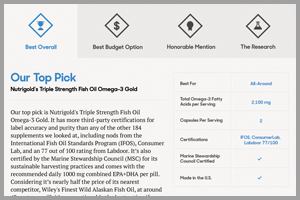
Product Breakdown / Review Process
There is a lot of content on each of your reviews. That is good, and that is bad. Content is key but quality content should always take precedence over the quantity. This section is a more granular deep dive in to each featured product and Reviews.com’s review process. It is a tab section which allows for a cleaner user experience on both desktop and mobile devices. This section ads one last call-to-action button on each product tab.
Sidebar
The sidebar is simple and could change easily. The space allows for multiple modules and a quick summary of Reviews.com. I have chosen a “Latest Post” module and a “Most Popular Post” module. These modules help users navigate and cycle through the website with ease.
Footer
No big changes here. Small adjustments include color conformity, and reversed color logo.